Little Canada Big Stories
By Chiedza Kaseke, Alisha Pereira, Nazifa Alam and Yijun Liu
Role: Lead UI/UX Designer and Programmer
OVERVIEW
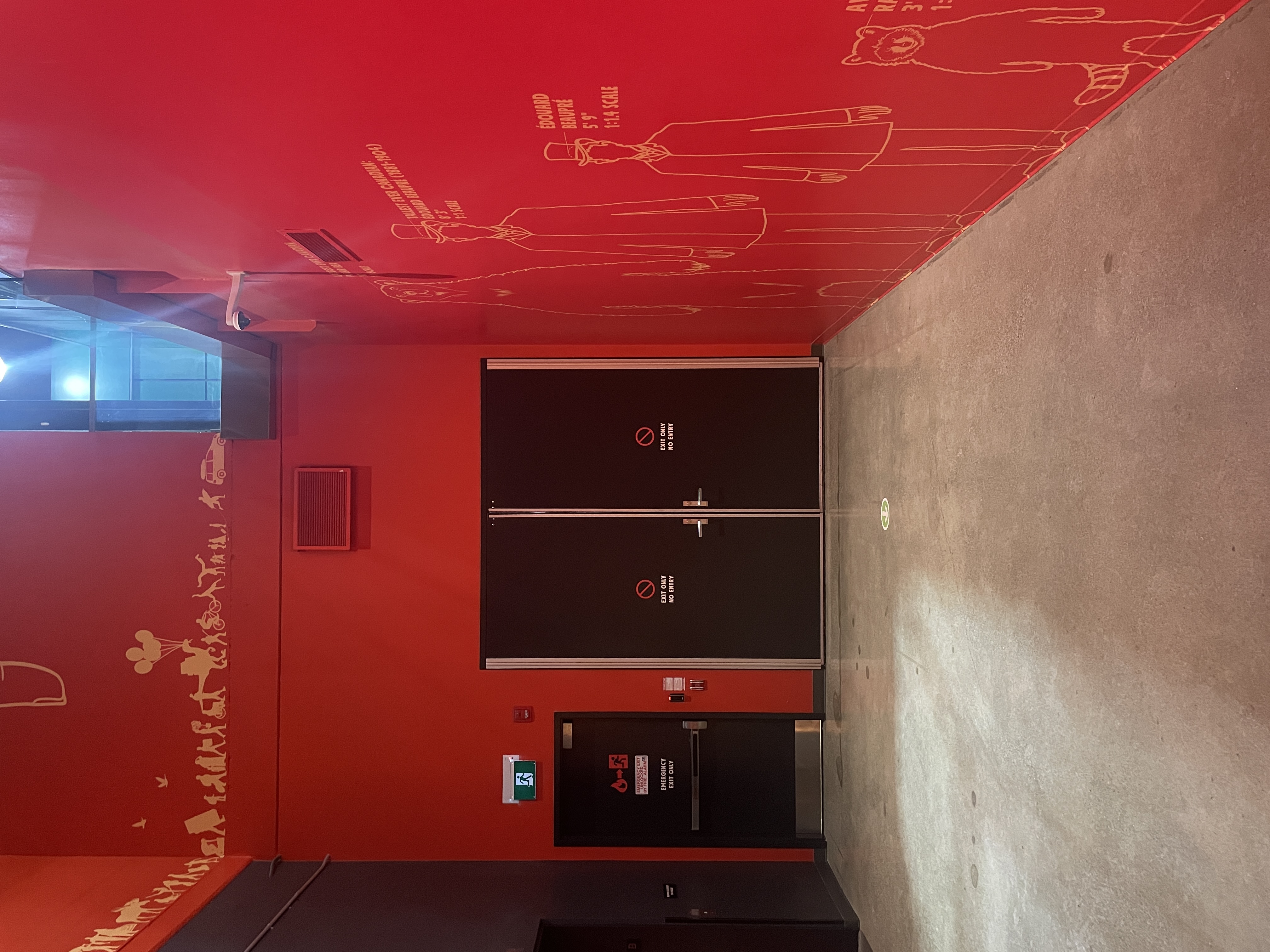
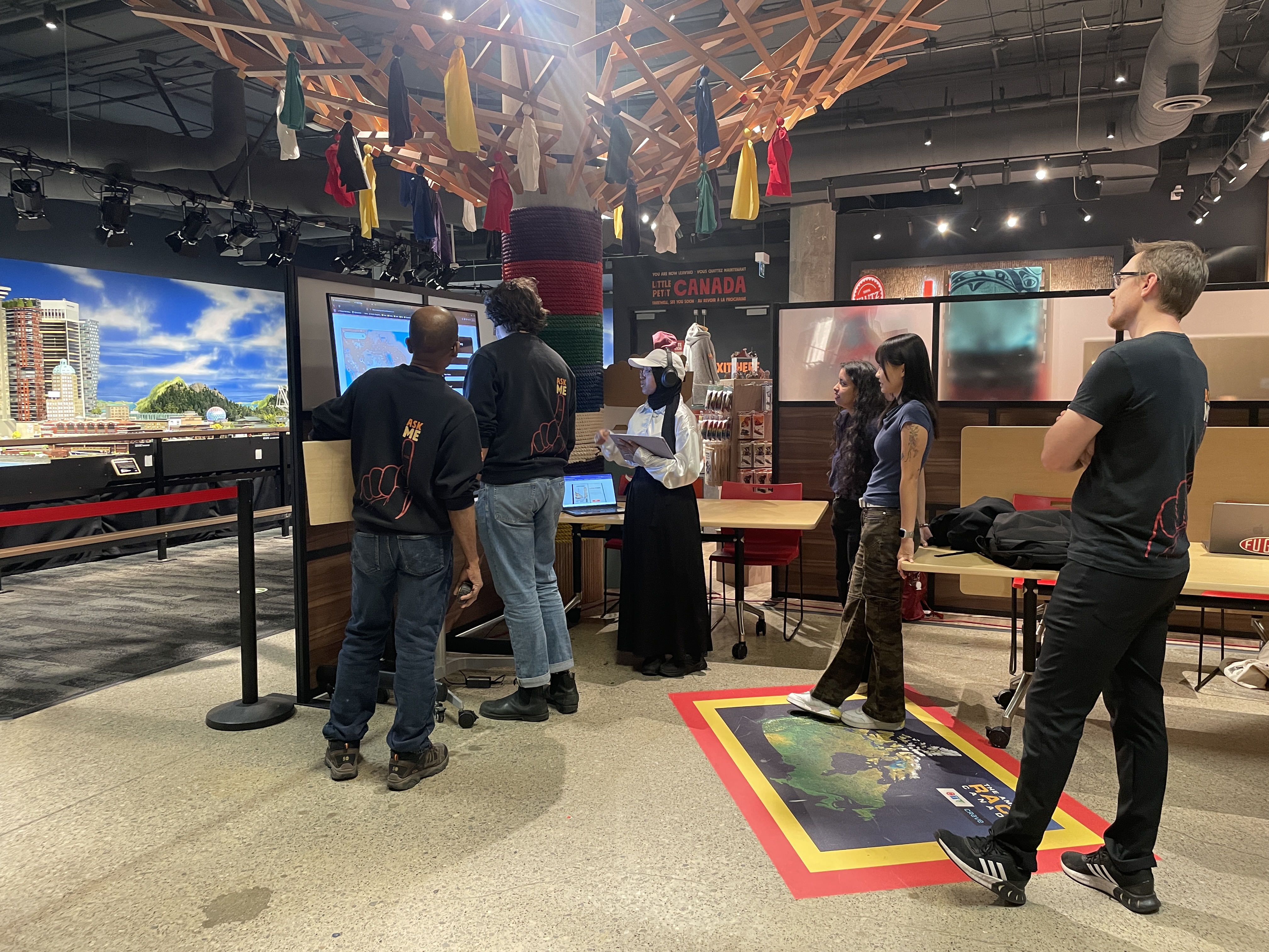
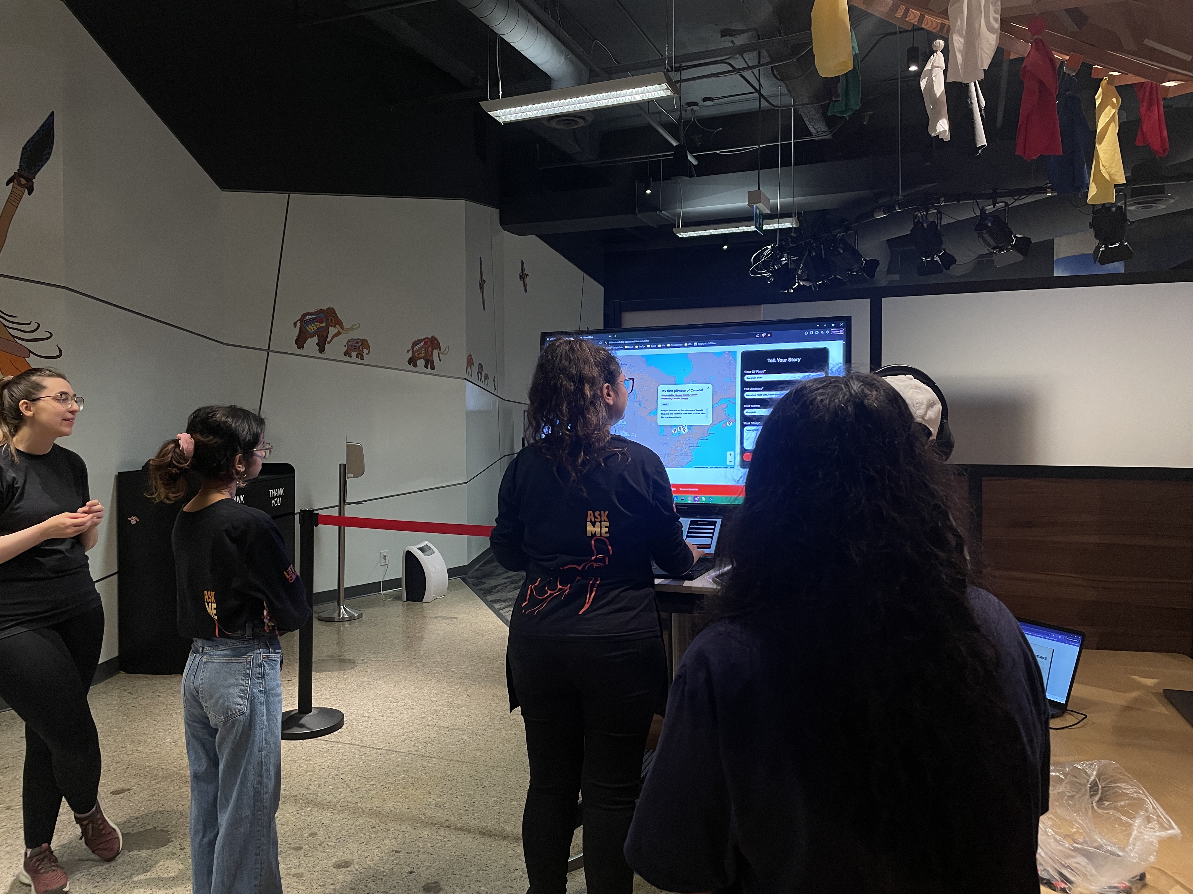
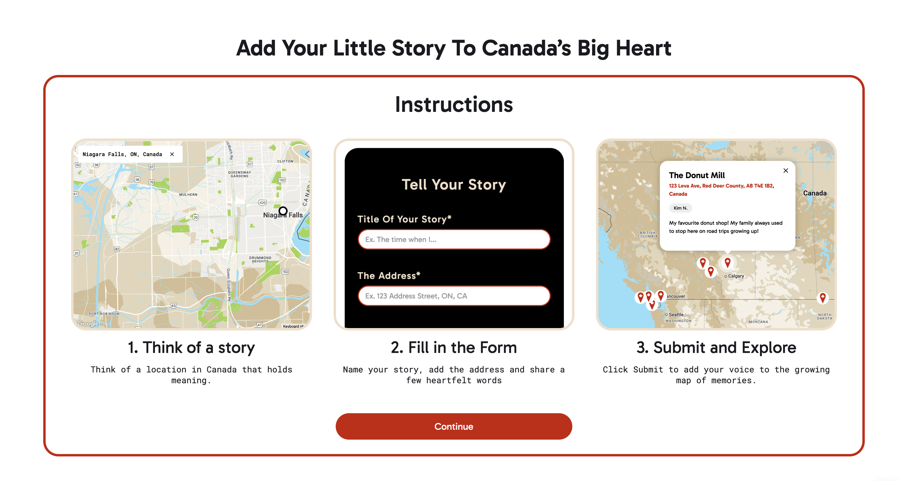
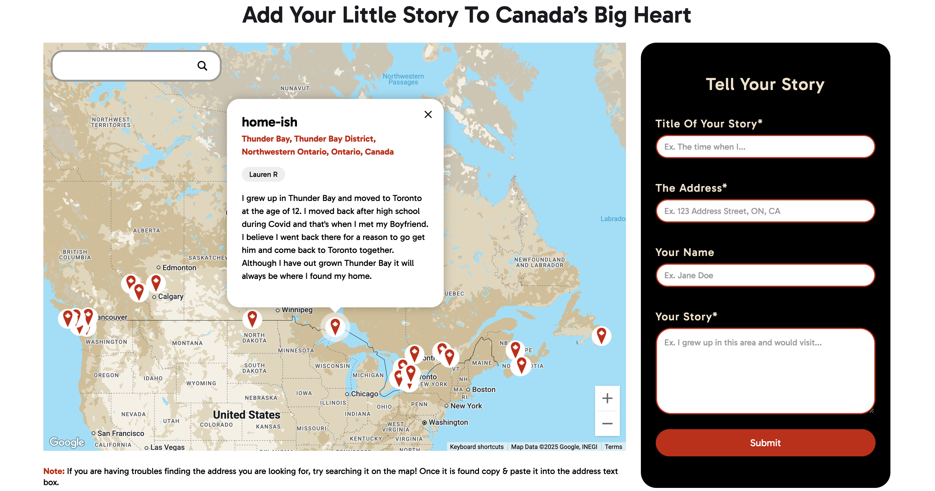
A digital product exit experience for Little Canada, a miniature exhibition space based in Toronto Canada, that allows their visitors to engage, interact and leave their mark on Little Canada.
Timeline: January 2025 - August 2025
Tools: Figma, FigJam, Webflow, Atlist, Zapier