The Kosh Box
2025
I was asked to develop the brand identity, marketing direction, packaging and website for The Kosh Box- a kosher gift box company that provides kosher self-care products to the people of Canada. The client wanted a brand that reflected elements of elegance, nature and indulgence.
Visual Identity
Primary Logo
Logo Variations
Color Palette
Logo Mark/Favicon
Illustrated Elements
Font Pairings
Cosi Times The quick brown fox jumps over the lazy dog
GT Sectra The quick brown fox jumps over the lazy dog
GT America The quick brown fox jumps over the lazy dog
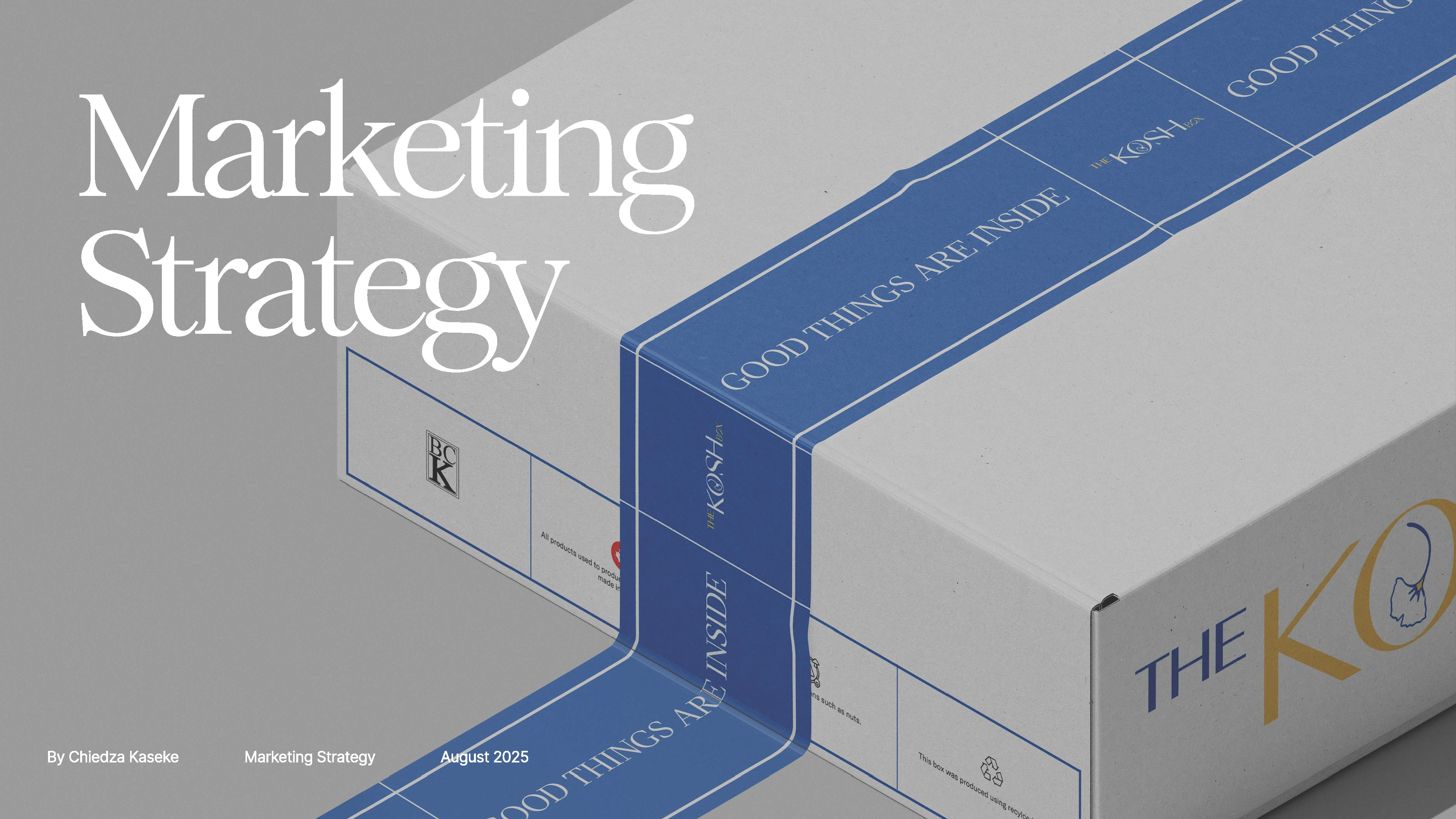
Primary Packaging
Outside
Inside
Packaging Tape
Primary Business Card
The main goal of each design was to invoke a feeling of serenity and elegance. By taking advantage of the colors meanings, it creates the following sensations and emotions for the user:

Gold: positivity and joy
Blue: serenity and tranquility
White: calm and clarity
Pink: Caring and youthfulness

Additionally, by making hand drawn elements of flowers, fruit, spices and leaves, it facilitates a connection between the user and their need to reconnect with nature and their self-care needs.  
Pattern Design Variations
Mood-board