WeTravel ZW
OVERVIEW
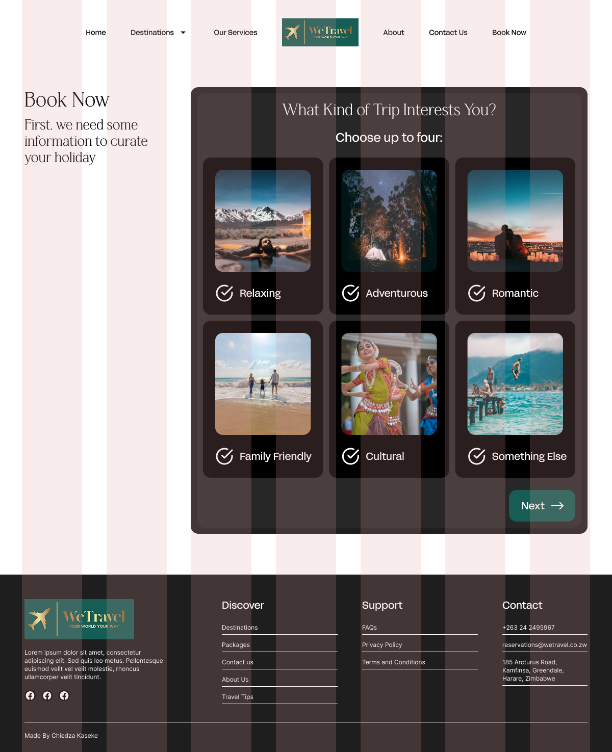
A travel agency's website that streamlines bookings, provides users with destination information and gives a new and fresh take on WeTravel's brand vision. Improving the travel booking experience for both the agency and customers.
ROLE
UI Designer, UX Researcher, Web Developer
TIMELINE
3 Months, Summer 2025
TOOLS
Figma, FigJam, Webflow, Google API
User Problem
The Agency is Overwhelmed With Bookings and Consultations...

WeTravel currently facilitates their bookings through phone calls, emails and social media direct messages. This results booking bottle necks and a lack of organization and as their business expands and their customer base increases.

Solution
An Interactive and Engaging Website That Streamlines Bookings and Information to and From Their Customers.

A website, developed on Webflow, that provides a visually pleasing and interactive way for users to make bookings, consultations and send inquiries to the Agency. Resulting in increased efficiency and organization on the agency's side.

VISIT
Research Methods
User Interviews and Heuristic Evaltuions...
First, I gathered data by interviewing the travel agents and users that frequently travel to better understand what pain points they face when bookings trips online. Additionally, I did a heuristic evaluation of 3 travel agency websites that are WeTravel's competitors.
Buyer and User Personas
There are Two Personas to Design For...
User Personas
As I am designing for both the travel agents and the customers, I made two user personas. The first is Kenny Gwatidzo, who has a busy schedule, does not have time to plan trips, wants to share trip information with his partner and prefers using companies with reputable reputations. The second is Tessa Chimbi, a travel agent that has to repeat information to each customer who calls, receives phone calls at all times during the day and finds it difficult to organize all the bookings that are made over the phone.
User Flow
How To Utilize A Simplified Navigation User Flow?
I wanted to address the pain points that came up in the interviews by creating a user flow that would be engaging and intuitive. By placing CTA buttons and forms through out the site, this would ensure the user has the opportunity to send an inquiry, book a consultation or book a trip at curial points in their user journey.
Key Features
3 Key Features Were Created For WeTravel.
To address the pain points brought up from both the agents and users, I developed 3 features that would streamline the booking process, give credibility to the company and have on hand information readily available at all times.  
Booking Form
A form that allows users to select which elements, accommodation, season and locations they would like to include into their holiday.
Reviews
Gives the company credability and legitemacy as the website is connected WeTravel's Google reviews
FAQ's
Information that is frequently asked and available for users to access at all times.
Wireframing
How Can I Solve The Pain Points With Structure?
This website that allows users to learn more about the destinations WeTravel offers, make consultation bookings, send inquiries and make bookings that are tailor made for them. Through this system, the agents are able to organize the different types of emails that come through, sort them through priority and focus on creating personalized trips for their cliental.
Design System
Providing Ease and Comfort To Users While Maintaining Structure and Clarity.
WeTravel takes pride in their customer service and providing a stress-free experience while planning their customers trips. I took this and their current branding into consideration and elevated it with the design system I created.  
Final Prototype
Travel Planning Made Easy and Simple For Both Users and Agents.
This website that allows users to learn more about the destinations WeTravel offers, make consultation bookings, send inquiries and make bookings that are tailor made for them. Through this system, the agents are able to organize the different types of emails that come through, sort them through priority and focus on creating personalized trips for their cliental.
VISIT
Key Takeaways
Personalization and Structure Show Consideration.

This project was very educational for me as it taught me how to design for two types of users at the same time. I had to consider the pain points of both personas and how I could go about solving the problems they faced.

The stakeholders were very happy with this final product and are looking at ways in which they can expand this further as they add more destinations to their travel list. They look forward to using the analytics that they can analyze and think that the website will bring in more sales and cliental. Overall, I am very happy with how this turned out and hope to take these skills into my next projects.

Back
Next