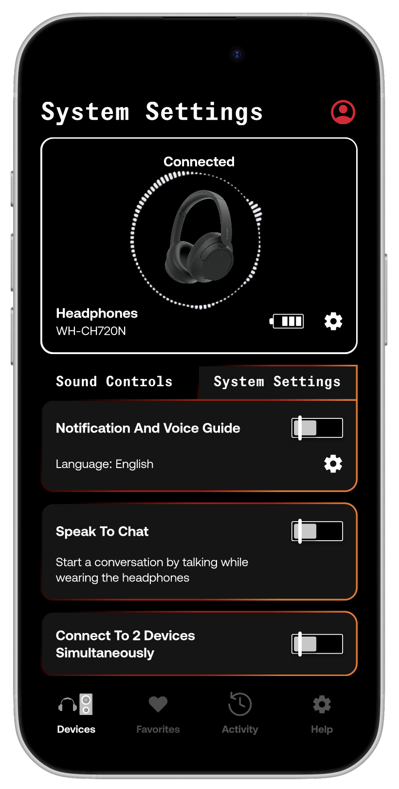
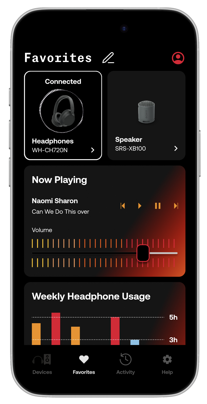
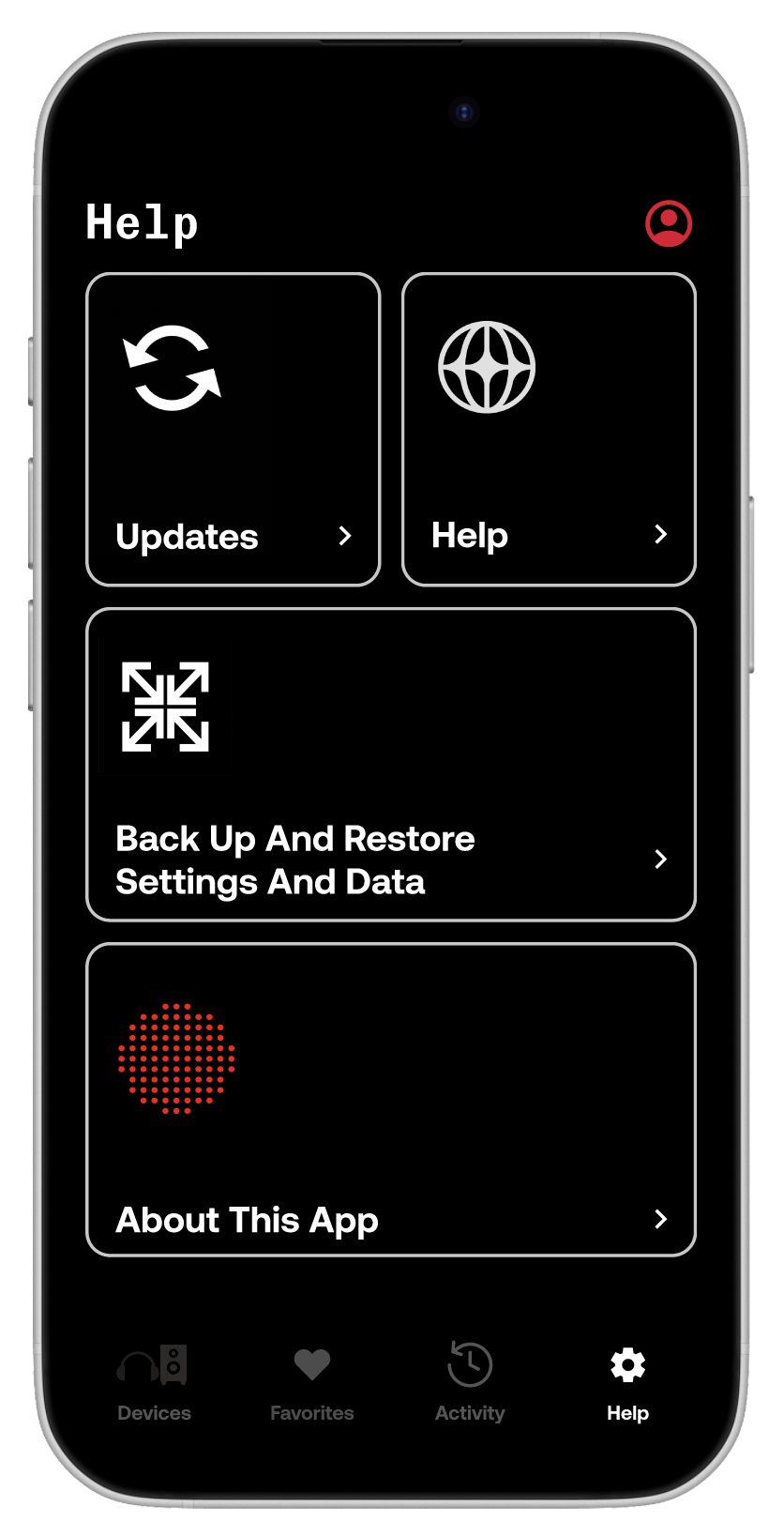
KIICHII
Role: UI Designer, UX Researcher, Web Developer
Timeline: January 2025 - May 2025
Tools: Figma, FigJam
SUMMARY
A clothing website that
The Problem
The Users Are Lost, Accessibility Is Missing and They Are Craving Something Fresh.

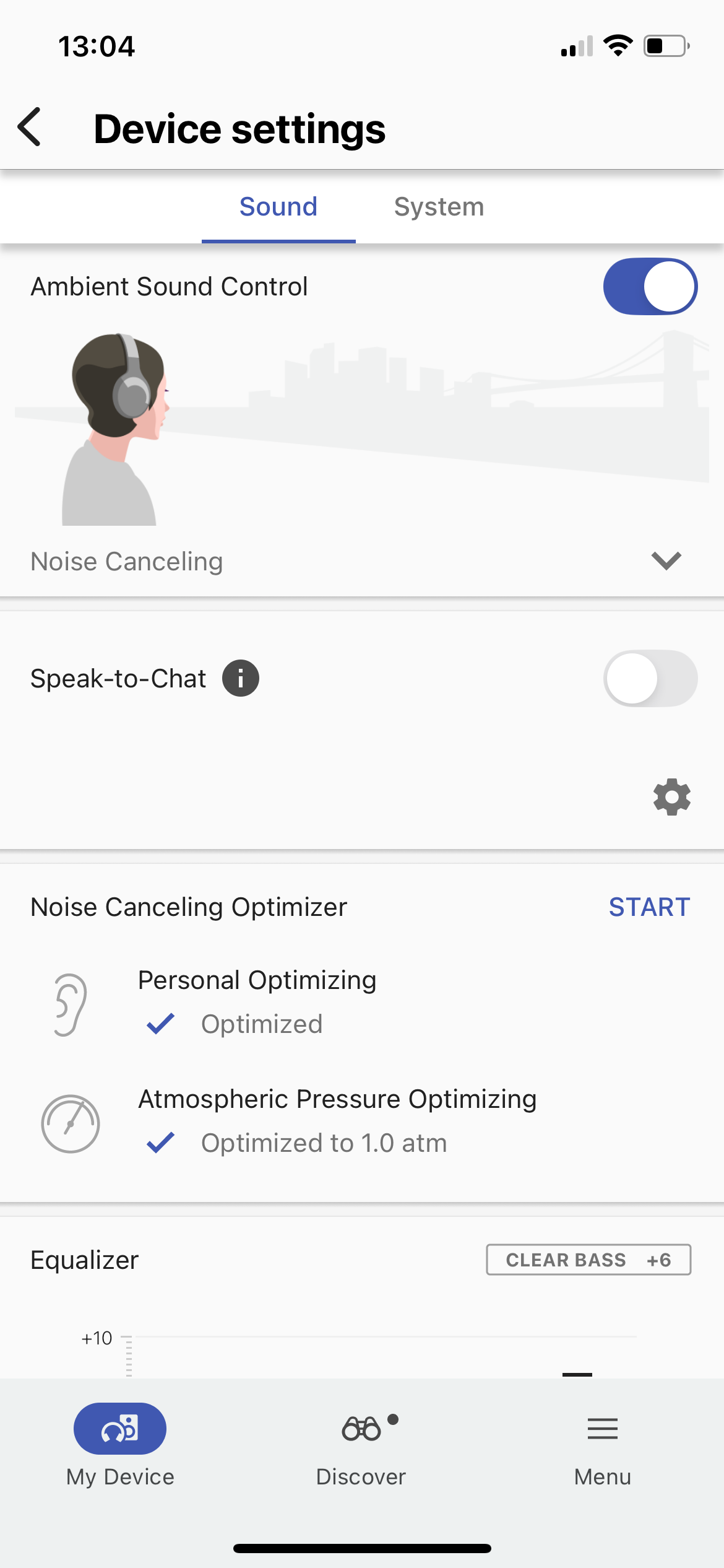
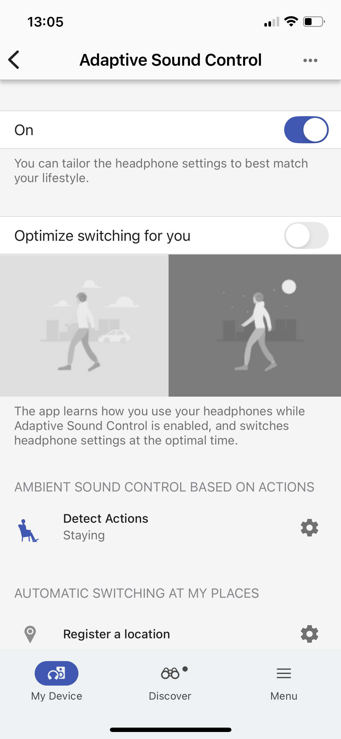
Users experience a number of frustrations when using the app they become dissatisfied and proceed to return their Sony products. Specifically the headphones due to pain points such as:

  • Navigation difficulites
  • Lack of accessibility considerations
  • Out dated design
The Solution
An Intuitive App That Combines Navigation, Accessibility and An Updated Interface.

A concise app, created on Figma, that still encompasses the brand fundamentals of Sony Music and elevates the users experience while incorporating accessibility, ease of navigation and a new take on their app interface.

TRY IT OUT!
Research
App Store Reviews and Affinity Mapping.
I gathered data from the 1-2 star reviews that were left from users on the app store and took an internal survey of the issues I myself experienced while using the app.
The main pain points were:
  • NAVIGATION: Users found that they were unable to move past certain pages or find crucial aspects such as the equalizer. They also experienced difficulty setting up their accounts.
  • ACCESSIBILITY: Users found that there was a lack of accessibility. They wanted more ways to use their Sony devices through the app instead of using the touch sensors on the devices.
  • DESIGN: Users said that the interface was outdated, The design is poor and that the settings they initiated would be reset to the default when their device was turned off and on.
  • RESPONSIVENESS: Users found that the app is not responsive at all on the iPad and a mini phone version of the app would be displayed.
User Flow
How Can I Make The App More Intuitive?
The first pain point users had was difficulty navigating the app or finding certain controls such as the equalizer. To solve this, I redid the apps user flow and changed the structure of the apps navigation to make it less complex.
  • Added a favorites page that allows users to add their most used widgets.
  • Made the devices page solely dedicated to what devices the user has.
  • Removed the need to click on each section separately and made pages for the sound controls and system settings.
  • Changed the activity page layout and added visuals for the weekly headphone usage section.
Accessibility
Let's Talk Accessibility...
The second pain point address was the lack of accessibility considerations. I addressed this by adding music controls in app so that users could use their Sony devices in the app instead using the touch sensor on their headphones. I also used high contrasting colors, distinct typography and a hearing health monitor that advises users on their headphone usage throughout the week.
Design
Letting The User's Take Control Like A DJ.
The third pain point addressed was the outdated design. By taking elements from Sony's existing brand guidelines and blending it with my own creativity, I was able to create a whole new take on music listening customization. By making the app interface like a DJ board, this would make the user feel like they were in control of their own DJ set. Making it both functional and fun to use.
Competitor Heuristic Evaluation
What Works For The Competitiors...
I evaluated Google Home and Spotify's Apps that require users to connect their devices, input personal data and change settings on them. I took note of how they implemented accessibility in their designs and their user flows.
Google Home App
  • Simple interface.
  • Consistent system status.
Spotify App
  • Minimalistic with prominent visuals.
  • Language matches the real world.
  • System status is very effective as it provides immediate feedback.
Prototyping
Testing Things Out...
This initial prototype was finished by the initial 3 day deadline. In this prototype, I had focused on solving the 3 main pain points I outlined. This did not leave a lot of time to develop the in depth design guideline I created after the deadline. However, this design is still clean, structured well and uses Sony's fonts and branding colors, staying true to Sony's branding as a whole.
Final Prototype
Take Control and Customize Your Music Listening Experience.
This prototype takes into consideration the 3 main pain points that users expressed in the reviews on the app store: complex navigation, lack of accessibility consideration and an outdated design. By changing the user journey and restructuring the page layouts, adding in controls and settings that allow users to with accessibility needs to use the app effectively and creating a design that is not only functional but visually interesting, this app redesign will improve the user experience exponentially. Successfully reducing the number of the returns of Sony's headphone's due to poor app usage and user frustration.
Key Takeaways
Have Fun When Using The Fundamentals.

Overall, I am happy with how this redesign turned out. As a long time user of this app, I was excited to redesign it and give it some elements of my own creativity. By giving myself a timeline of a week, I was able to challenge and improve my decision making skills.

By giving myself more freedom to develop a visually interesting interface, I was able to push myself and create a project that I am pleased with. I am now more confident in my decision making and designing for accessibility needs. I look forward to developing the UI for the iPad as that was a pain point I did not focus on in this project.

Back
Next