Agency59 Website Redesign
Website Redesign to Streamline Project Viewing and Job Application Process
2024
By Chiedza Kaseke, Irena Faiz, and Valerie Bian
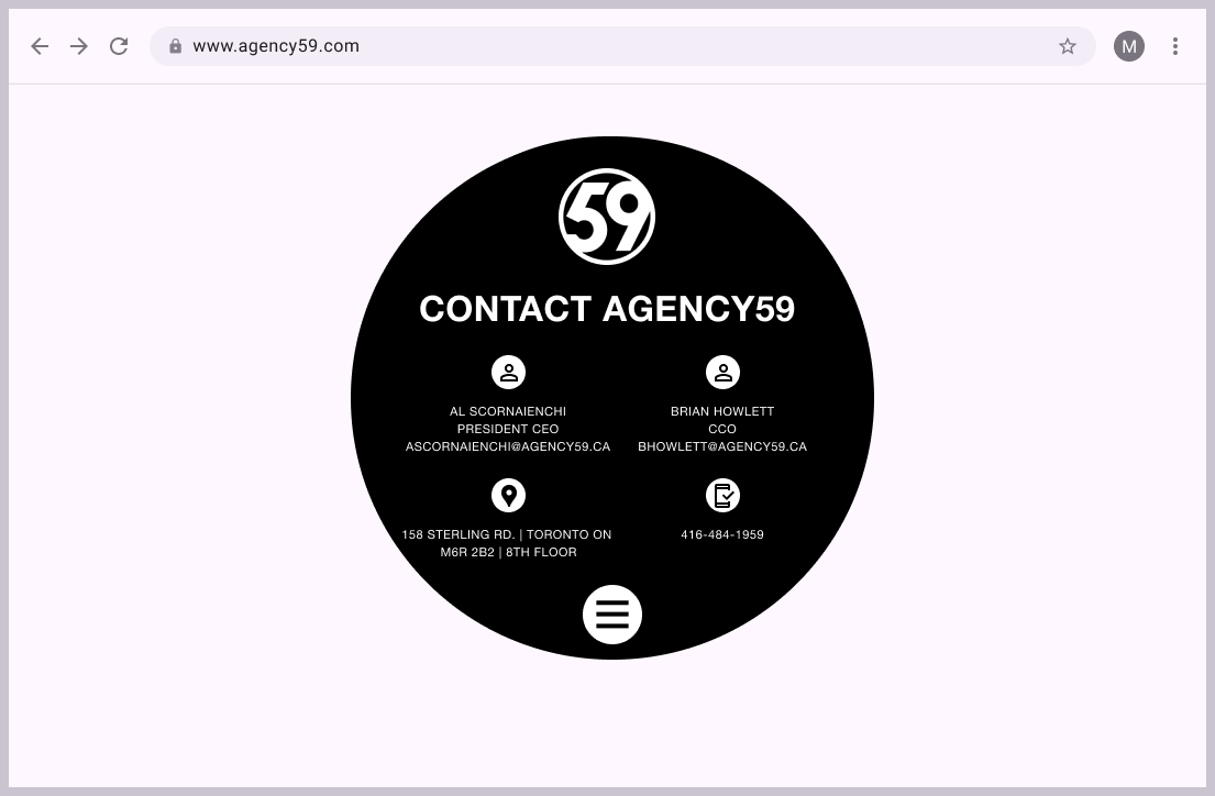
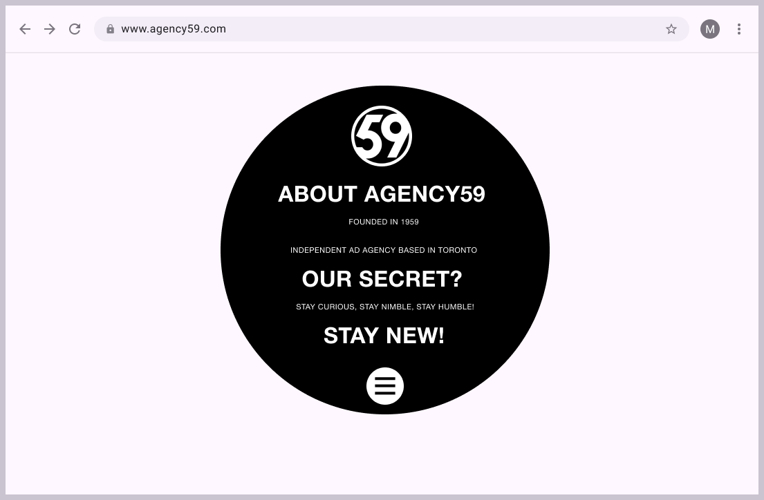
Our project focused on developing a high fidelity redesigned portfolio website for Agency59, a marketing agency based in Toronto Canada.

Objectives: Make the user experience seamless, the task flow simpler and implement smoother navigation for users to submit job applications.

My Role: UI/UX Designer
The Problem

The lack of clear visual cues and efficient feedback slows down the user process and adds friction to the user experience.

  • Unclear navigation due to inconsistent signifiers and lack of user visibility feedback.
  • Users were unable to search for specific clients or and encountered issues with mapping and conceptual models.
  • Confusion on where information was located.
The Solution

A concise portfolio website, created on Figma, that still encompasses the brand fundamentals of Agency59 and elevates the users experience while completing the key processes highlighted in the beginning.
The Process
The Heuristic Evaluation
The two key processes evaluated on the original website were:
  1. Usability - Our assessment of this process was that there was complexity navigating the website due to a lack of a consistent menu and back button.
  2. Information discovery - Our assesment of this process concluded that there was no process to find a specific client and that the user would have to click on each project to find what they were looking for
First Prototype
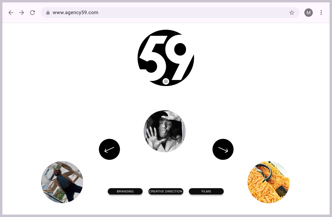
Our first prototype was made with the processes we evaluated in mind. We wanted to improve the user experience by making the landing page more organized and easier to navigate each page by adding a menu that was constantly there for use.
Usability Testing
The Set Up
Our testing environment was held in a google meeting. Participants were screened out accordingly. Screen recordings of the call were further analyzed. The participants were asked to fill out a form before starting to gather their data. It was collected anonymously.

Our total Sample size included N=7 , n=3 were screened out.
Usability Test: The results provided us with ways in which we could improve the visual signifiers and make the task flows easier and more accessible for users. We took these insights and applied them to our final redesigned prototype.
User Tasks
  1. Apply for a Job — Navigate to the careers page, find the studio designer position, submit an email to the agency. This task should be completed in 5 minutes, giving the user ample time to find the careers page and submit an email.
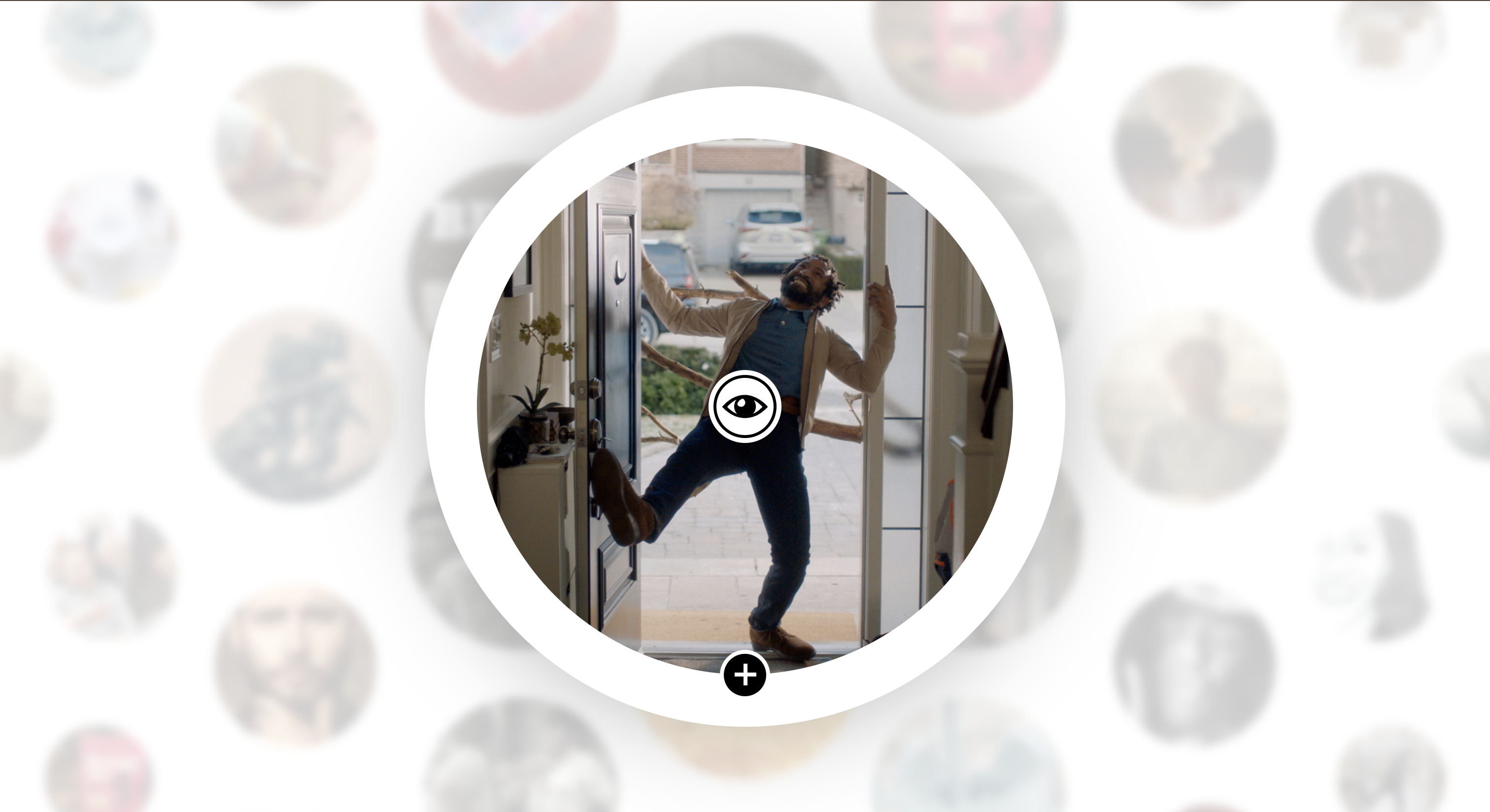
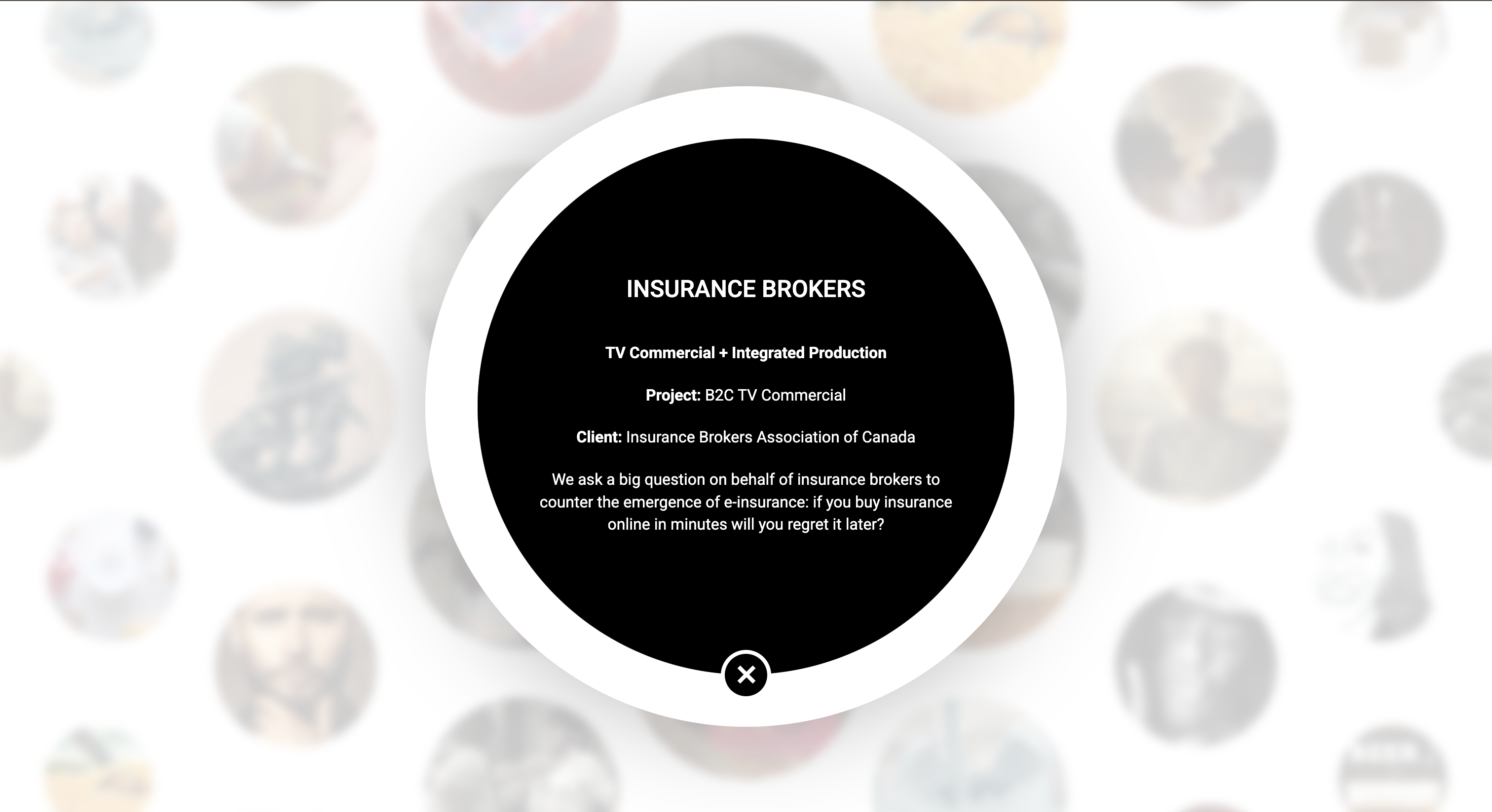
  2. Find a Specific Client — Locate a specific project using the filter features (Origin Organic) or arrows and find more information about the client through the info tag. This task should take 3 minutes to complete as it usually takes users 2-3 minutes to locate a project on portfolio websites.
User Feedback

Key issues and what needed to be address for the final redesign:


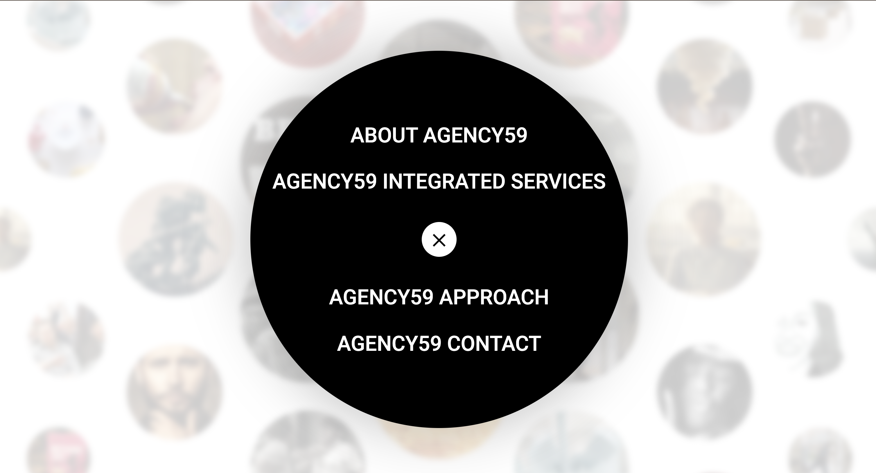
  1. Hamburger Menu — Navigating the menu page was difficult and some steps could be cut down to shorten the task of searching for information about the company.
  2. Carousel wheel — Older demographic did not appreciate the carousel wheel, they would prefer a search bar with a full list of their past projects and clients.
The Final Prototype
Firstly, we added a menu for users to navigate through the website with ease. Allowing them to visit each page at their own discretion and not have to use the back button if they wanted go back to a previous page.

Secondly, we added a process for submitting resumes and a page that displays what job positions are available.

Lastly, we developed a client list page as well as a tag filter system to look for projects related to certain mediums such as films, branding or creative direction, in order to make the navigation process easier for users.
Final Research Insights
  1. Participants found the hamburger menu hard to find and navigate when trying to complete the first task.
  2. Participants found it harder to find the careers button in order to find the careers page. They appreciated the user feedback after applying to the studio designer job.
  1. Users from an older demographic did not like the carousel and would prefer a search bar while the younger users appreciated the carousel design. 
  2. Participants found the second task fairly straightforward and appreciated the clean aesthetic and the filters. 
Conclusion

Overall, there were minor improvements we could have made to make the user experience even more seamless but unfortunately, we were unable to because of time constraints. I was happy with how the development process went as this was my first time implementing user testing and holding testing sessions in person. Going forward I will use what I learnt to improve upon my future projects.

Prev
Back To Top
Next